MIXTAPE: Fourth Wall Breakers
September 22, 2015 - Mixtapes
I’ve always been attracted to media that break the fourth wall. In movies and TV, this can be used to resist the traditional philosophy that the equipment that makes a film is ugly and uncouth and should be treated as a silent observer of a spontaneous display of narrative. Turning and speaking to this stuff can feel like a rejection of this philosophy and everything it implies: that the “behind the scenes” labor is less important, that a story can be separated from the method of its telling, that filmed stories just happen rather than being carefully designed.
Games that metaphorically break the fourth wall use their own techniques to acknowledge the mechanisms that make digital art. The ten games on this mixtape all acknowledge their status as games in different ways and find various walls within their medium to break. Many of them, too, act as reminders of all the messy, physical stuff around games that is conventionally treated as invisible.
Milk! (2012)
hirsch
Windows
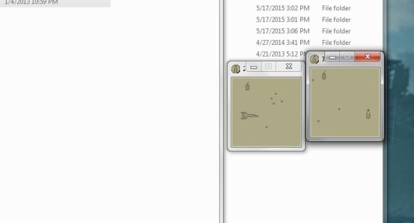
Milk! breaks the fourth wall in a pretty literal way, if you think of window borders as a wall. Breaking this particular wall disrupts the conventional separation between a program and the surrounding operating system. This can be a bit of a trick. I admire Milk! because I once tried to write a similar program and found it incredibly annoying to code. The tools Windows provides to programmers aren’t designed to make this sort of thing easy. That reflects a decision made long ago that the arrangement of windows in space wouldn’t be meaningful to the program running within a given window.
Milk! comes from a world where a different decision was made, and the layout of windows was meaningful. Different software would have been made in that world, and the metaphors we use around computers would have been a little different. Games that push against the boundaries of their toolset always appeal to me because they help you see how the toolsets shape and limit the things made with them. So many conventions surrounding software go unquestioned in digital games, and they really shouldn’t.
Jungle Max (2012)
thecatamites
Windows, Mac
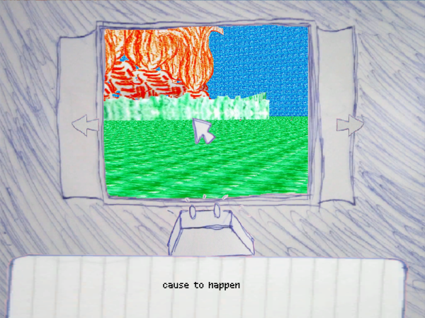
Jungle Max depicts a mostly-barren world filled with strange objects whose purpose is unclear. The game itself feels like it could be one of these objects. Playing Jungle Max felt like I had picked up a weird little game lying in the desert and couldn’t quite figure out how it worked or where it came from. A lot of short games feel like this, but Jungle Max really leans into the feeling with its design. With an interface that looks like someone drew a handheld game on notebook paper, it’s easy to think of it as a physical object, to wonder about where you might have found it and what context it belongs in.
The strangest thing to me about Jungle Max is how it combines inputs from your keyboard and the buttons on its internal frame. If you did find this object in the desert, you could turn but never move forward. Moving around this little world isn’t possible unless you control it from within and without its frame of reference at once. This game doesn’t seem to belong entirely anywhere.
Math Land (2010)
increpare
Browser (Flash)
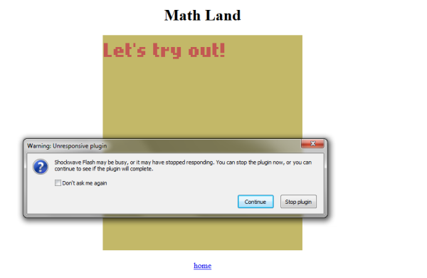
Sometimes breaking the fourth wall isn’t entirely intentional. In games, the hidden machinery frequently reveals itself in the form of bugs. Like boom mics dropping into view, bugs ruin the illusion that this is all happening spontaneously, and can reveal how these things are made. Maybe for this reason, boom mics and bugs are both deeply hilarious to many audience members.
Just as some movies might drop in a boom mic as a joke about bad filmmaking, Math Land is a game designed to crash. This is kind of funny by itself, but the way it crashes is actually a little educational about how code works in edge cases. Each of Math Land’s rooms demonstrates a math problem that can be dealt with on paper but which computers aren’t generally equipped to handle by default. Different programming languages handle those cases a little differently. That means that something like Math Land is specific to its language, which in this case produces “Not a Number” results for some of the problems, “infinity” for others, and freezes the browser on the infinite sum. I like the way this treats a programming language as a material to play around with.
Memory Leek (2012)
Seagaia
Browser (Flash)
Memory Leek, like Math Land, plays with intentional bugs, but in a different way. It’s not a reminder of the specific strangeness of code, but rather of the literal machinery that code runs on. A memory leak is a common coding error in which a program requests RAM but doesn’t tell the operating system when it’s done with it. If a program with a memory leak keeps running, it will over time tie up more and more of the available memory, slowing down the entire computer.
Memory Leek does what it says: the more you smash against the tank, the more memory it requests without freeing it. You’re supposedly getting water for your thirsty family, but your sad little family doesn’t react at all and the water’s just running uselessly onto the floor. This is an apt metaphor for a memory leak, which also wastes a ton of resources for a dimly remembered purpose. By playing directly with RAM, Memory Leek is a reminder that, while code is an abstract concept, how we execute it is a physical process with physical constraints. Your score in the game is directly limited by the sticks of memory in your motherboard.
Handheld Video Game (2012)
Folmer Kelly
Browser (Flash)
In a previous mixtape, I looked at games that accuse the player of being bad for playing them at all. Since quitting seems like the “right” move in these cases, they all had to awkwardly contend with the fact that there’s no good way to make quitting feel like a meaningful action within the game. Execution does a decent job of this, but only if it occurs to the player to play it twice. On the other hand, when I convinced myself that quitting Savior was the only way to progress, I just ended up ruefully playing the game over from scratch.
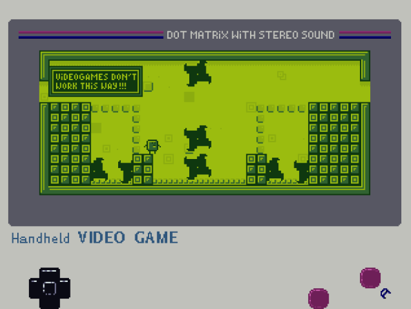
Handheld Video Game shares themes with these games, but by breaking the fourth wall it comes up with an elegant way to make quitting meaningful. Initially it’s not obvious why the handheld styling of the game should be important enough to merit a place in the title. But that turns out to be a subtle hint to the solution. By presenting itself as a handheld game, Handheld Video Game could make the option to quit a natural (if hidden) part of its interface. You can even access it before playing through most of the game, but realizing you need to get there is the point.
Atum (2013)
Team Cupcake
Browser (Unity Web Player)
Atum reminds me a bit of what are sometimes called exoludic games. These games ask the player to do something in their physical environment to support the game’s rules. I’ve found some of these games, like Blues for Mittavinda, incredibly moving, because games that blur the line between the digital and the physical resist the disembodiment that sometimes comes with videogame playing. I can’t treat a game as a vague abstraction if my body is involved in it.
In a way, Atum is a reversal of this type of game. Instead of the player allowing a game to affect them in the real world, Atum imagines a game that allows the player to influence it with real world objects. This has a very different effect. While games like Asphyx or Blues for Mittavinda feel like objects in a broader ritual, Atum feels more like a play on novel input methods like the Kinect. The real world becomes material for the game, instead of vice versa. This feels like a way of narrowing the scope of the game, rather than expanding it as exoludic games do. The self-devouring storyline takes this narrowing of scope to its natural conclusion.
The Shadowland Prophesy (2012)
Andi McClure
Windows, Mac, Linux
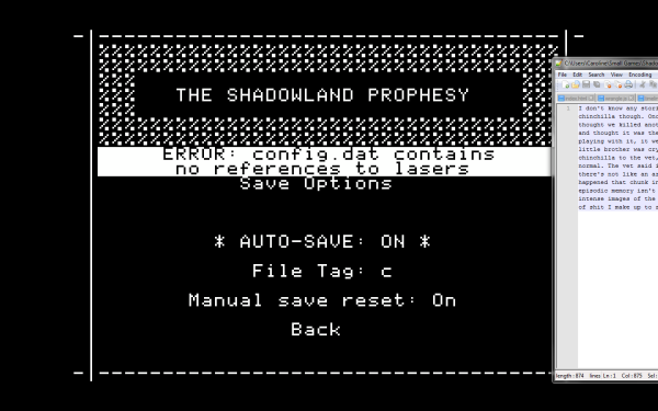
In order to get to a game, a player usually has to go through a lot of non-game stuff. They have to get it installed, deal with any setup or configuration issues, work through the initial menus, and so on. Usually all this is meant to be in the background; sometimes it’s designed to harmonize with the game it leads to. But it’s generally meant to be pushed aside in favor of the main event. The Shadowland Prophesy takes all this stuff and makes a game out of it in its own right. Navigating a menu becomes a maze. Fixing installation issues becomes a creative writing exercise. A whole lovely little experience happens in all the space before you get to a game proper.
Sometimes the purpose of calling attention to parts of a game that are usually invisible is to make a point about artificiality. But that’s not quite how The Shadowland Prophesy feels. I think it calls attention to all the non-game surrounding a game just to call attention to it: here, check this stuff out, it can be neat and interesting too if you stop and look.
HAX (2012)
Alex Raymond
Windows, Mac, Linux
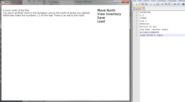
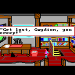
I’ve been thinking a lot about adventure game puzzles lately as part of the Line on Sierra project. In general, the structure of these puzzles is to present the player with a desired condition (I am through that door) and leave it to them to figure out how to get there (USE KEY ON DOOR). The solutions to adventure puzzles, especially in text-based games, end up sounding a little like instructions, or like an outline to a script. You know what you want; you just need to spell out how to get there.
HAX inverts the what and the how of this equation. How to get things and reach states is trivial, once you figure it out; what’s tricky is knowing what things and states you need. This leads to a different way of thinking about these problems. I found it quite freeing after all the time I’ve spent wrestling with puzzles from the other direction. It made me think about the game from more of a designer’s perspective than as a character in the world. What kind of obstacle would I set up at this point? HAX presents an intentionally nonfunctional world and leaves the player to go through, giving it shape bit by bit.
This is also the only game I know of that contains an Easter egg inspired by me. Therefore HAX is the greatest game ever made.
Nous (2011)
Pohung Chen, Trebor Connell, Brett Cutler, Jason Meisel
Windows
I typically approach games as an authoritative voice to which I am trying to adapt. Indeed, I can get a little neurotic about how much I like throwing myself at the mercy of a system that isn’t actually capable of caring how well I please it. So I identified with Nous, because it depicts a game as neurotic about figuring out what the player wants as I am about games.
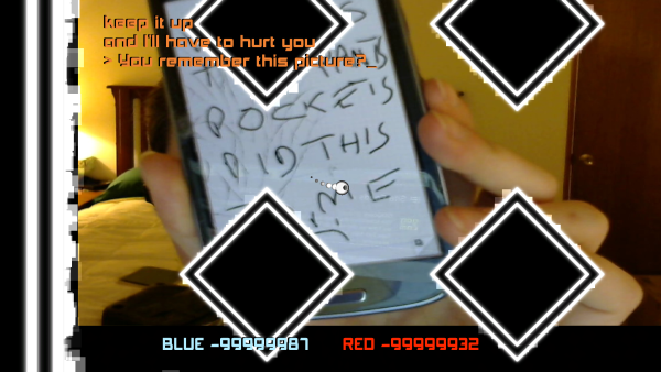
Nous seems kind of mad that you’re playing it. It breaks the fourth wall in a traditional way, by talking at you in a way that can’t be reconciled with its internal fiction. But it also uses some specifically gamey tricks, like faking a crash and pretending to destroy a random image from your Pictures folder. (It doesn’t actually delete the photo. It’s just trying to get you to care.)
It’s pretty common for games to play with the metaphor of the game as commander to the helpless player. Nous occasionally feels like one of these games, because there are parts where it tells you what to do and then mocks you for doing it. But because it keeps changing tactics, and seems to get increasingly upset, this power dynamic feels reversed. It’s like watching a game throw a tantrum. It’s trying to figure out what you want from it and getting unreasonably angry that it doesn’t know. I know how that goes. By the end, I felt really sympathetic towards the game’s voice. I don’t know if there are multiple endings. I do know that I don’t feel like pursuing an ending other than the one I got, which was a big spikey hug for a messed-up machine. You’re okay, Nous.
Important Game You Should Play
Sophie Houlden
Windows, Mac, Linux
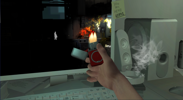
First off: you need to play Important Game You Should Play. You really need to. Download it now. Please, listen.
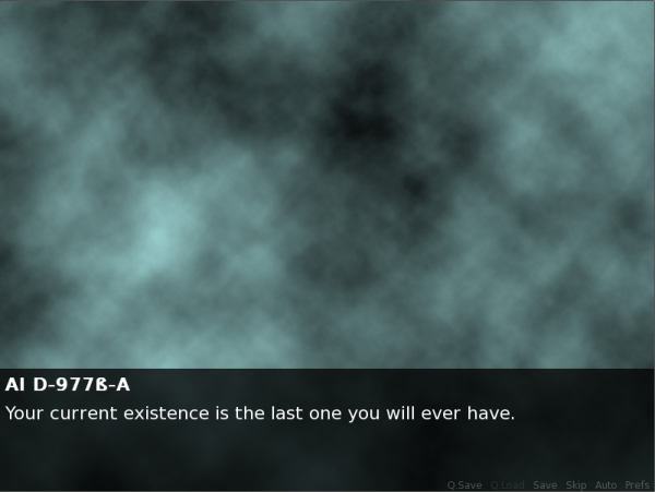
Assuming that’s covered, and if you’re willing to play into the premise, you’ve had an experience I find very curious. On the one hand, Important Game You Should Play reads like a sci-fi variation on the common “Please Wake Up” creepypasta. It shares some of the quietly disorienting vibe of the better versions of the creepypasta, but overall it left me with a feeling that was more melancholy than scary. For one thing, it doesn’t ask you to wake up: quite the opposite. It’s just letting you know that something bad has happened, that your whole life is something bad that happened, but there’s nothing you can do about it.
The game does something else that I find really cool. It encourages you to imagine yourself as the protagonist of a game someone else has been playing for a very long time. To me the strangest thing about Important Game is imagining who that player is, and why they made the decision to experience my life in particular. What kind of person do you imagine when you imagine someone who wanted to play as you? Is your story comforting escapism to them, or a cathartic tragedy, or are they just the kind of troll player who locks you in a room and deletes the door? It’s important to remember that this message wasn’t meant for you, but for them. How did they take it, and will they change their play style in response to it? How was your life different before and after playing this game?
