What’s the Point of Limbo?
February 14, 2012 - Features
Since its release on XBox Live Arcade in 2010, Limbo has racked up awards and generated a substantial amount of critical writing. I didn’t have XBox Live when it came out, so I’ve been waiting on a PC port. When it finally came out on Steam late last year, I jumped on it. This turned out to be a disappointing experience.
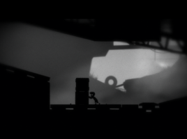
Given the critical reception Limbo received, I expected one of two things. Either this would be a game that pushed some boundaries or a game that was remarkably well put-together. Limbo is neither. It follows well-worn traditions in art games, and its design lacks direction. It has a beautiful audiovisual style that tries to create a unique atmosphere, but other elements of the game undermine this atmosphere at every opportunity.
I could easily forgive the lack of novelty if the design were coherent, and I’d forgive the incoherence if it had something new to offer. As it is, Limbo is neither special nor well-crafted, though it feints enough in both directions to stand as an impressive achievement in artistic ass-covering. Its unusual visual style lets it be categorized as an art game at first glance, while its overall polish invites judgement by more conventional criteria. This is clever maneuvering that, if successful, lowers expectations in all directions. If unsuccessful, it offers the opportunity to fail in multiple ways at once.
A Thin-Skinned Approach
Limbo is a side-scrolling puzzle game with a bit of timed platforming and a lot of block-pushing and gravity puzzles. This base gameplay wouldn’t be out of place in a Mario title, and is usually found in games that evoke a sense of playful experimentation. What Limbo does is take this base gameplay and skin it with visual and sound elements that are meant to evoke sad and dreadful emotions instead. It retains a familiar play style while placing it in a different atmosphere. This strategy itself is a very familiar one in the world of art games.
One of the very first well-known art games, 2005’s Super Columbine Massacre RPG!, skinned a story about the Columbine shootings over the generic JRPG mechanics of RPG Maker. More recent examples include Don’t Look Back (action platforming plus the Orpheus myth), Hey Baby (first person shooter plus street harassment), Dear Esther (3D exploration plus ramblings on death and madness), and Jason Nelson’s body of work (sidescrolling exploration plus the contents of Jason Nelson’s mind).
With its shocking content and novelty factor, Super Columbine Massacre RPG! had a significant cultural impact in its time. Subsequent explorations of the skinning strategy have dealt diminishing returns, however. They tend to sound better in concept that they play in practice, and the inherent disconnect between form and content usually leads to a jumbled end product. In Jason Nelson’s case this dissonance is probably intentional, but often it’s just a result of lazy thinking. As Hey Baby demonstrates, the skinning strategy produces some of the worst that art games have to offer.
Limbo, then, is not pushing any boundaries. The skinning strategy has been and continues to be well explored, and Don’t Look Back in 2009 beat it to the specific combination of platforming, death, and the underworld. There is novelty in the presentation style, but by itself that can only go so far. A game’s presentation can make a strong first impression. But as you learn the system of the game, that impression slips into the background. The visual and sound elements become more important as feedback from the system than as pleasures of their own. It’s likely that there is significant variation in a player’s threshold where the presentation style slips from foreground to background in this way. Nonetheless, I’m unimpressed by games that expect the strength of that impression to last from start to finish. It shows a lack of holistic thinking about how the game’s elements fit together.
What is Limbo for?
This is ultimately my deeper objection to Limbo: it doesn’t fit together. Maybe the purpose of Limbo isn’t to experiment, after all, and novelty is an unfair criterion to judge it on. That means it must have some other purpose. Maybe it’s trying to evoke a set of emotions, or express a point of view, or deliver an experience, or tell a story, or build a world. But for any of these things to happen (and it’s not clear which one Limbo is aiming for, if any), the game needs internal consistency. Limbo is lacking in that department.
What is Limbo about? (By that I don’t mean, “how can the ending be interpreted,” because I am not presently in a college dorm.) The most easily supported answer to this question is that Limbo is about death. It’s named after a part of the afterlife, its ending evokes a ghost story, and the protagonist dies, prominently, a lot, and in loving detail. The brain slugs recall zombies. The black and grey aesthetic is associated with death. Leaving the details of the story aside, I think it’s easy to agree that whatever Limbo‘s artistic purpose is, it has something to do with death.
Beyond that, things get a bit confused. The presentation aesthetic says that death is grim and sad, but the variety and design of the death scenes says that death is entertaining. Your protagonist gets beheaded, dismembered, impaled, and tossed around every way a 2D ragdoll can from start to finish. These death scenes are often amusing and always well-executed. I know I jumped into a lot of obvious death traps to see if I’d be rewarded with a new animation. The sound design says that death is scary and dreadful, but the frequent and painless reloads say that death is a brief slap on the wrist for small mistakes. Does Limbo want to be lighthearted or dreadful? With all these contradictions, it’s hard to make a strong case either way.
One possibility is that this disagreement in the text is intentional. You could argue that the point of Limbo has something to do with the messiness of emotions surrounding death. It’s even possible to see it as a meta-commentary about how videogame death contrasts with real world views of death. The problem with that argument is how much of Limbo is completely irrelevant to it. What does block pushing have to do with death? What about gravity switches? These puzzle elements don’t threaten death, nor do their presentations evoke death in any way. And they become more and more central as the game continues.
This is strong evidence that the game’s incoherence is not an intentional attempt to make a point about different views of death. If one major element of the game is unrelated to the rest, it increases the probability that other disconnected elements are the result of a generally haphazard approach. My intuition is that Limbo‘s awkward treatment of death is the result of conflicting pressures on the game’s design. It is meant to be beautiful, accessible, fun, challenging, unique, and moving all at once. I don’t think it’s impossible to make a game that does that. I do think it’s enormously difficult to design something to that many constraints at once without individual pieces fighting against each other. And I don’t think Limbo even comes close to succeeding.
It did succeed at meeting at least one of these constraints: the visual and sound design are indeed beautiful. It’s a waste to have these elements in service to a game that fights against them and lessens their impact. By the end of Limbo I didn’t notice that beauty anymore because I was focused on the movements of blocks and the precise timing of a flickering danger surface. In the end, what I remember are those blocks and how much I hated them. The good parts of Limbo deserved better.


